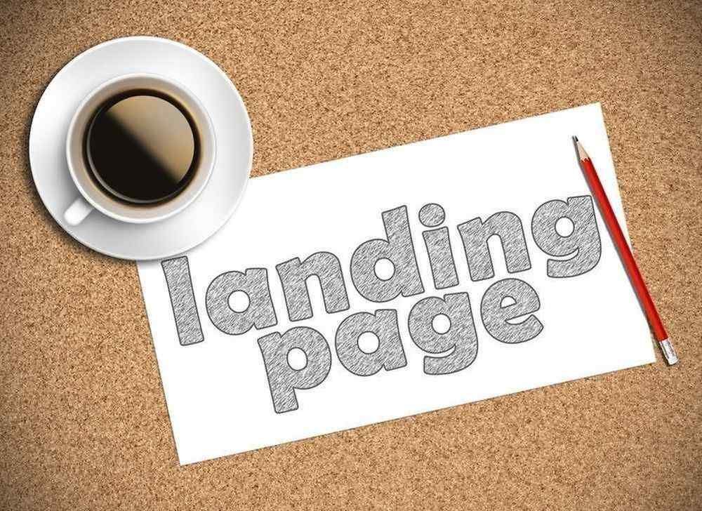
You only get one chance to make a first impression, as the old adage goes, and while that doesn't specifically apply to landing page design, it's certainly comparable. If you are running campaigns without optimizing your landing page, your chance to make a good first impression is lost. As a result, consumers may be bouncing at a higher rate.
Though there are many ways to optimize your landing page design, here are some quick fixes you can do right now to reduce bounce and encourage conversions.
Punch Up That Headline
Even if your landing page is mostly graphics or video, consumers will still look for a headline to tell them what your page is about. Though you may have already done your keyword testing and A/B testing to find the perfect headline, if consumers can't see it immediately or relate it with the rest of the content on your landing page, you have a problem. Make sure that your headline is in big, bold text and is either above or to the left of your featured image, video or text to ensure that it can easily be found.
Use Flawless Grammar
If you can't spell, punctuate or form sentences properly, don't expect many consumers to trust you or buy from you. Be sure you use spell and grammar check and a second or third set of eyes to re-read your work. This may sound simple, but would you buy from me if I said, "Weve bin n bizness 4 many years, you can trust us to assist with all you're flooring needs 4 any room." The answer is no.
Respect the Fold
While the idea of pushing important information above the fold goes back to the newspaper age, it now also refers to the point at which a user would have to scroll down to get more information. Ensuring that your landing page design keeps the meaningful information above the fold will go a long way toward getting consumers' attention. In fact, in an advertising study done by the Nielsen Norman Group, it was found that elements in the 100 pixels above the fold were viewed 102 percent more than those placed just below the fold. No matter whether your landing page is mobile or desktop-based, if users have to scroll down to get information, your message is being lost.
Bullets and Lists
Consumers (including YOU reading this) don't like to feel like they have to work hard to digest information. You may have a lot of interesting data and research to present to the information-hungry consumer, but if you present this as a wall of text, they probably won't read through it — no matter how interesting. However, simply breaking up your information with subheadings and bullet points will instantly give your landing page a more readable quality, prompting users to actually take a look and consider what you are offering, instead of immediately clicking away.
Though landing pages differ wildly depending on content and targeted consumer, an ideal landing page should have a few elements in common, including a bolded headline, well-formatted text and content that is placed above the fold. If you are auditing your landing page design and find that they don't conform to these simple design standards, it may be time to make some changes.


