"Get Started."
"Try For Free."
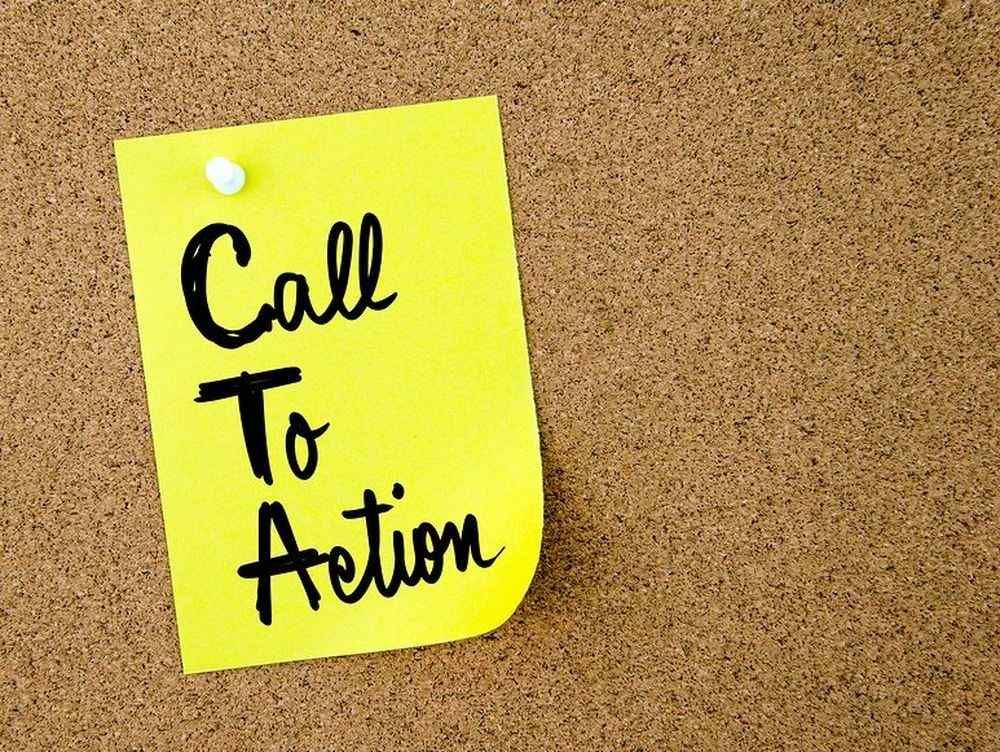
These are only just a few words. But they have power. The way this microcopy is handled across your digital marketing campaigns makes all the difference in whether or not someone clicks a call-to-action (CTA). Without it, user experience (UX) plummets. Boredom sets in. People leave the site. And you're stuck looking at stats that tell you your marketing skills need serious work. While there are a lot of important metrics to make sure that your campaign is as effective as possible, no one wants to report back on a low click-through rate.
Does your CTA have a low click-through rate (CTR)? Are you looking to create an irresistible CTA that users can't help but click? You don't have to be a skilled copywriter to create a click-worthy CTA. You just have to know what makes people click.
Here are 5 actionable ways to get users to click your CTAs:
1. USE ACTION VERBS
It's all in the name. Call-to-action. The whole point of creating CTAs (other than to make sales or build an email list) is to get people to do something while they're on your site. And what better way to inspire action than to incorporate action verbs into your copy?
Let's say you want people to try your product. And let's say you're offering a free trial. It's much more effective to say, "Click here for a free trial" than it is to write, "Free trial." See the difference? It not only reads better but it also helps direct readers to take action.
2. CREATE A SENSE OF URGENCY
Using words like "Now" or "Today" creates a sense of urgency and makes users want to take action right then and there. They feel that they will miss out on something if they don't click right away. You can also achieve a sense of urgency by using an effective psychological tactic called scarcity. Coffee company Aquaspresso's CTA phrase, "Send Me Specials Now!", is a great example of a scarcity marketing tactic. They are urging people to check out "today's specials" in exchange for their email address. This lets readers know that these specials are only available for a limited time, which creates a fear of missing out (FOMO) on a valuable offer.
3. WRITE FROM A FIRST-PERSON POINT OF VIEW
Within Aquaspresso's CTA phrase, they used first-person language. This presents the action from the user's point of view, which personalizes the message. A recent study showed CTAs that used first-person language had a 90 percent conversion rate than CTAs written in second person. By writing your button copy in the first person, you are giving your reader control and adding variety to your copy. Writing CTAs in first person can call attention to potential customers because it is so unexpected.
4. USE CONTRASTING COLORS
To make your CTA buttons stand out from other content on the page, you should use contrasting colors. You don't want your buttons to blend in with everything else. The best way to avoid this is to use compelling colors that contrast with the overall color scheme of your site. You also want to make sure that the color of the text inside the button stands out and is readable.
5. MAKE IT PROMINENT
Your CTA should be big enough for users to clearly see it, but not too big that it overwhelms the page. If you have a longer page with lots of copy, it's important to strategically place your CTA button throughout the page so that it doesn't get lost in the text. There's nothing worse than creating a CTA that no one will see.
At Cox Media Group Local Solutions, we will help you get noticed by your targeted audience and convert your visitors into customers. Contact us today to learn more about our proven digital marketing solutions.

