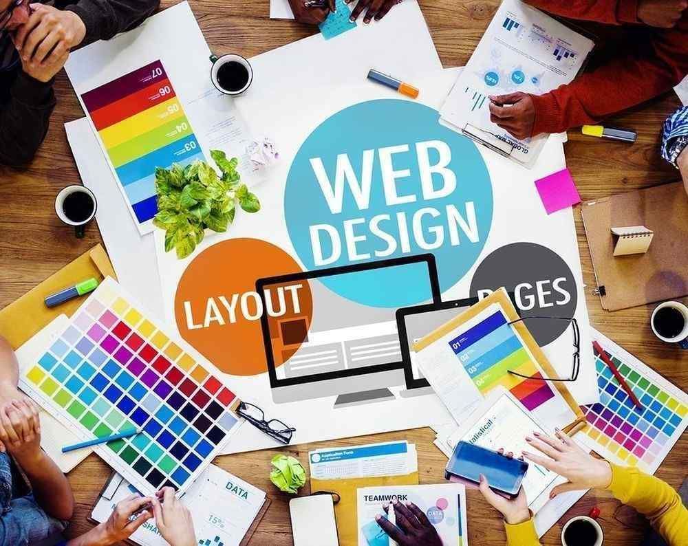
As many organizations update their websites based on the latest Web design trends, there is a potential for your site to get lost in the monotony. However, as current developments are all about finding unique ways to connect with your audience, there are more opportunities for you to make your site stand out to a targeted group. Overall, most trends in imagery, layout, color and typography are moving toward a simpler design.
Imagery
As 1stWebDesigner points out, one of the current Web design trends involves incorporating large background images. While you may already be seeing these types of images everywhere, you can give your brand an edge by adding subtle movement. According to 99designs, one variation on this trend is animated storybooking, in which an animation sequence is triggered when a user scrolls to a certain position on his or her screen.
Movement can also be created with parallax scrolling, a design technique in which background images move more slowly than foreground images, giving the illusion of depth. Another way for you to bring your brand visuals to life is by using cinemagraphs, or still photos in which a subtle movement occurs repeatedly. Because these types photos do not incorporate major movements, they keep your load time to a minimum, which is an added bonus.
You can also make your images stand out from the crowd by incorporating hand-crafted illustrations. With the rise of sites like DeviantArt, 99designs and even Tumblr, it's never been easier to find freelance artists whose style meshes with your brand.
Another major trend in website appearance is a flat design, in which elements that give the illusion of three dimensions, such as drop shadows, gradients or textures, are stripped. According to 1stWebDesigner, "The main function of the flat design is to put emphasis on content while design [serves] as a communication tool." This trend is becoming particularly popular because many developers are embracing Google's Material Design philosophy.
Layout
The main factor that's driving trends in layout is mobile. If you are building a new site, it absolutely, positively must be responsive. Simply put, this means that no matter how someone is viewing your site (whether on desktop, tablet, or smartphone), they will see a site layout that is designed specifically for that device, greatly improving the user experience. And while there has been an upsurge in responsive design, the card layout has also become extremely popular. A card layout is a modular layout that displays information in small, bite-sized bits, with pages broken up and reordered on a constant basis, depending on screen sizes.
While cards do tend to make good use of white space and motion to create a layered design, they're currently best suited to mobile apps. But this trend is not so much about the modular look or motion. Instead, this style reflects a reengineering of the Web, which is moving away from pages and destinations and moving toward personalized content instead.
Color
It's been proven time and time again that the strategic use of color can boost conversions. As such, the colors you choose for your fonts and backgrounds play a major role in your website's success.
According to 99designs, one of the top Web designs of 2015 is minimalism. As the site suggests, you can minimize the color and content you provide, and then add interest through "big, realistic videos," instead. You can also keep your site visually stimulating by introducing different shades of the same color throughout a page. This variation on the monochromatic design allows your site to stand out.
Typography
If users have trouble reading your website content, they will likely bounce to another site. As such, the font you choose plays a major role on your traffic and conversion rate. Current trends predict that hand-lettering, letterpress style and photo overlays will prevail this year. There will also be a greater adoption of skeuomorphic icon fonts. Remember though - while decorative fonts are great for headlines, leave page content in a simple, easy-to-read sans-serif font. As current trends call for a minimalist approach to design elements, colors and text, the typography you choose is more important than ever.
Keeping these trends in mind for the next redesign of your website can help make your site more appealing to consumers, which in turn can help drive more visitors to your site.
